Beautifying the Drug Store Aisle
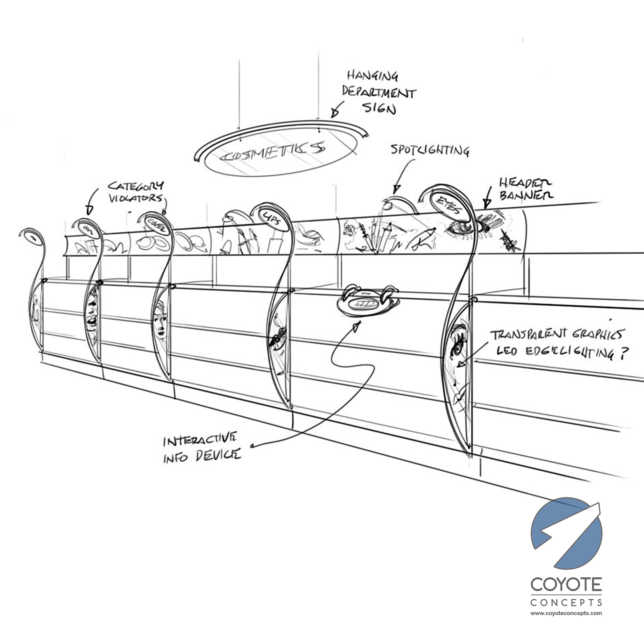
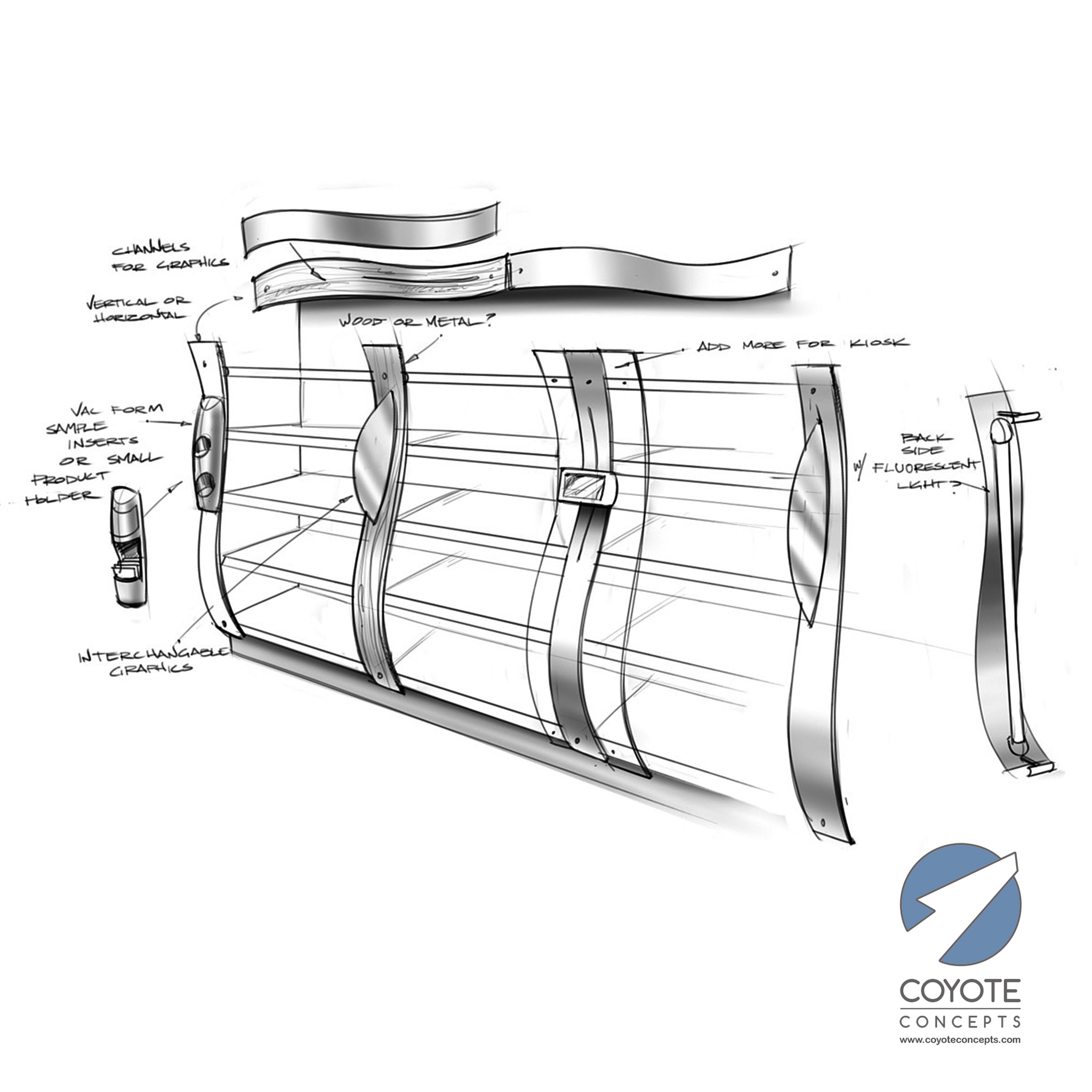
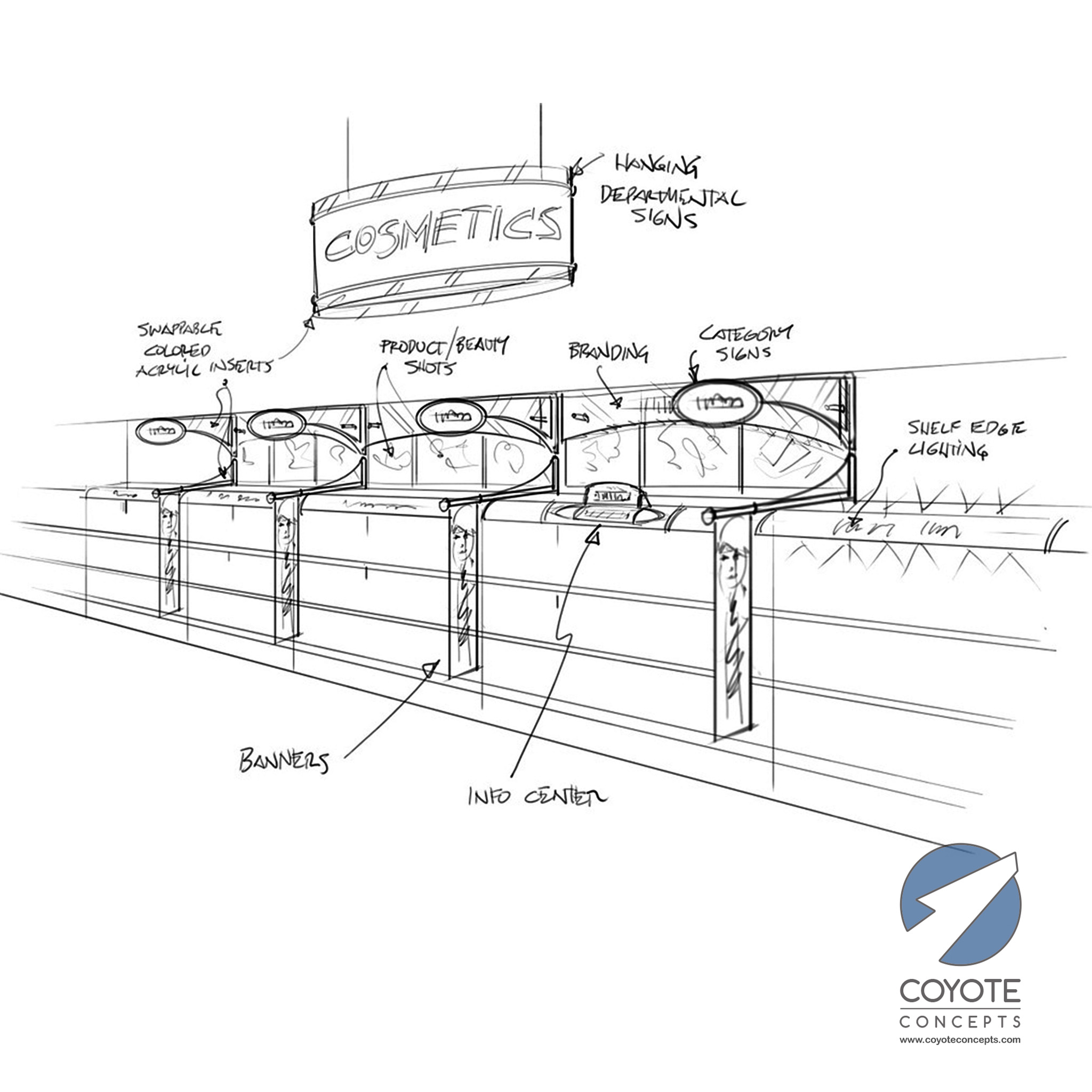
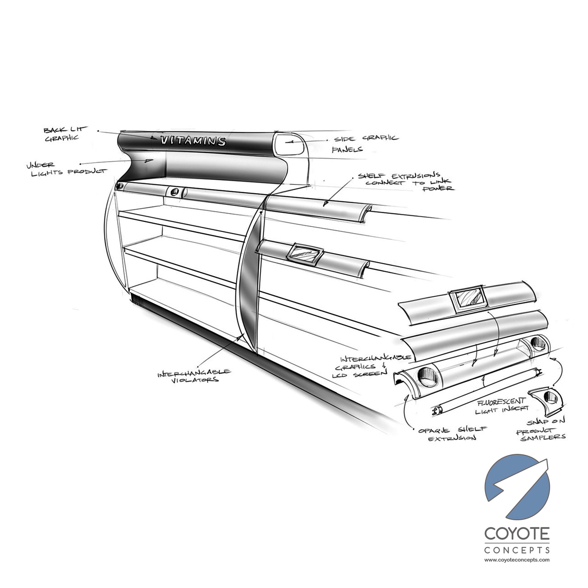
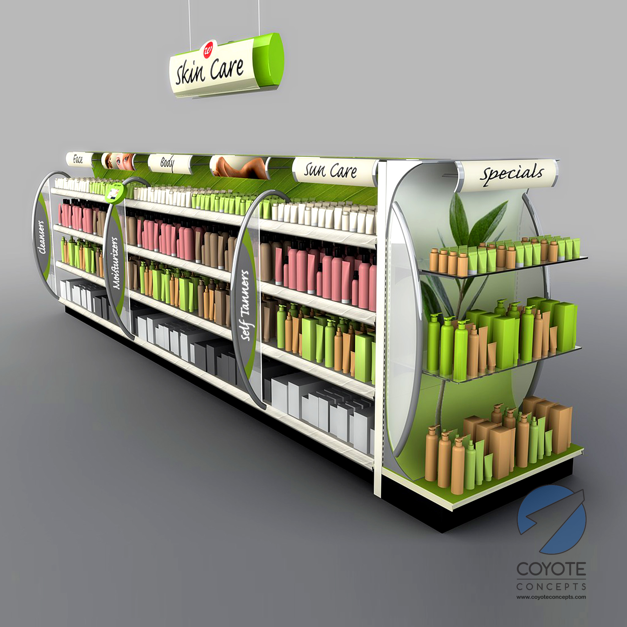
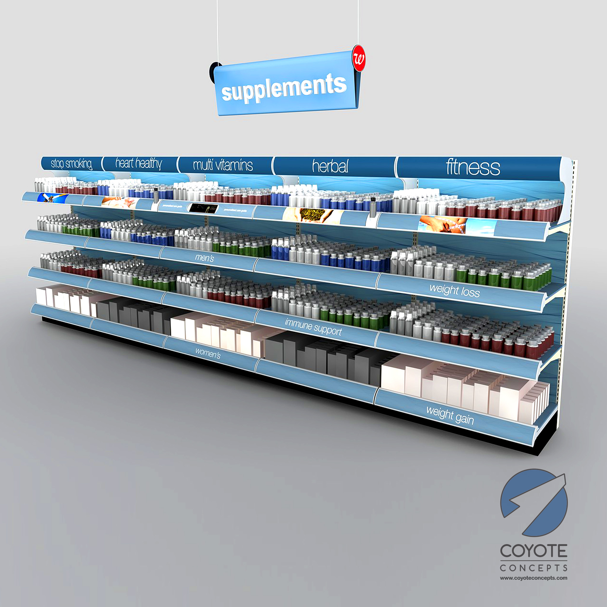
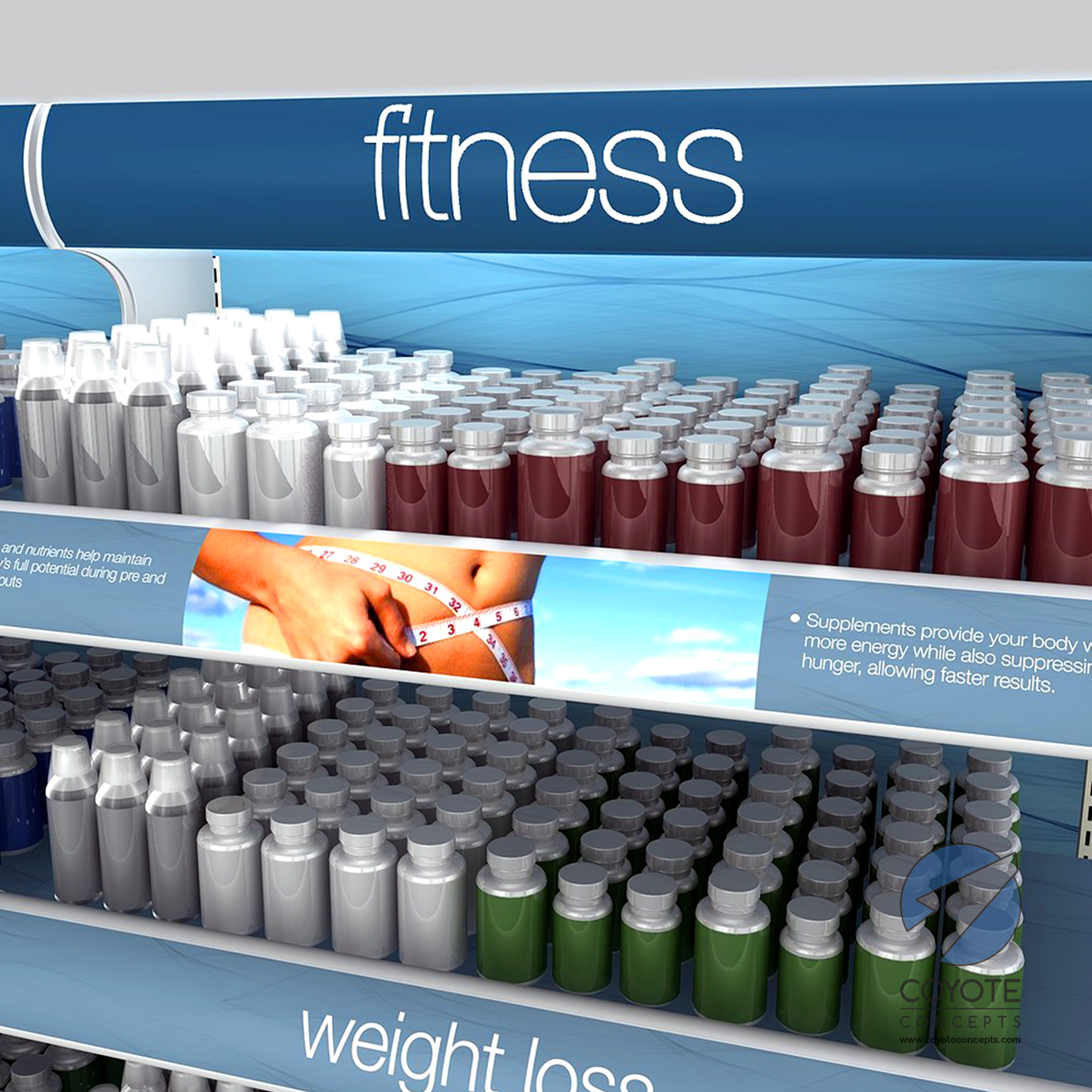
Back in 2009 we were grateful for the chance to design a merchandising system that would add some visual pizzazz to the aisles of a major drug store chain. We the freedom to add aisle interrupters, shelf treatments, lighting, shelf organizers, and overhead signage to dress up ho-hum standard gondola shelving, we were able to create something much more visually compelling and functional for them. We paid particular attention to providing consumers with bold and clear category labeling to make it easy to navigate. We also incorporated product education opportunities in the form of sample areas, educational signage, and small integrated flat screens for digital media. After a round or two of rough sketching we narrowed down the choices and moved into 3D. The results are below.
