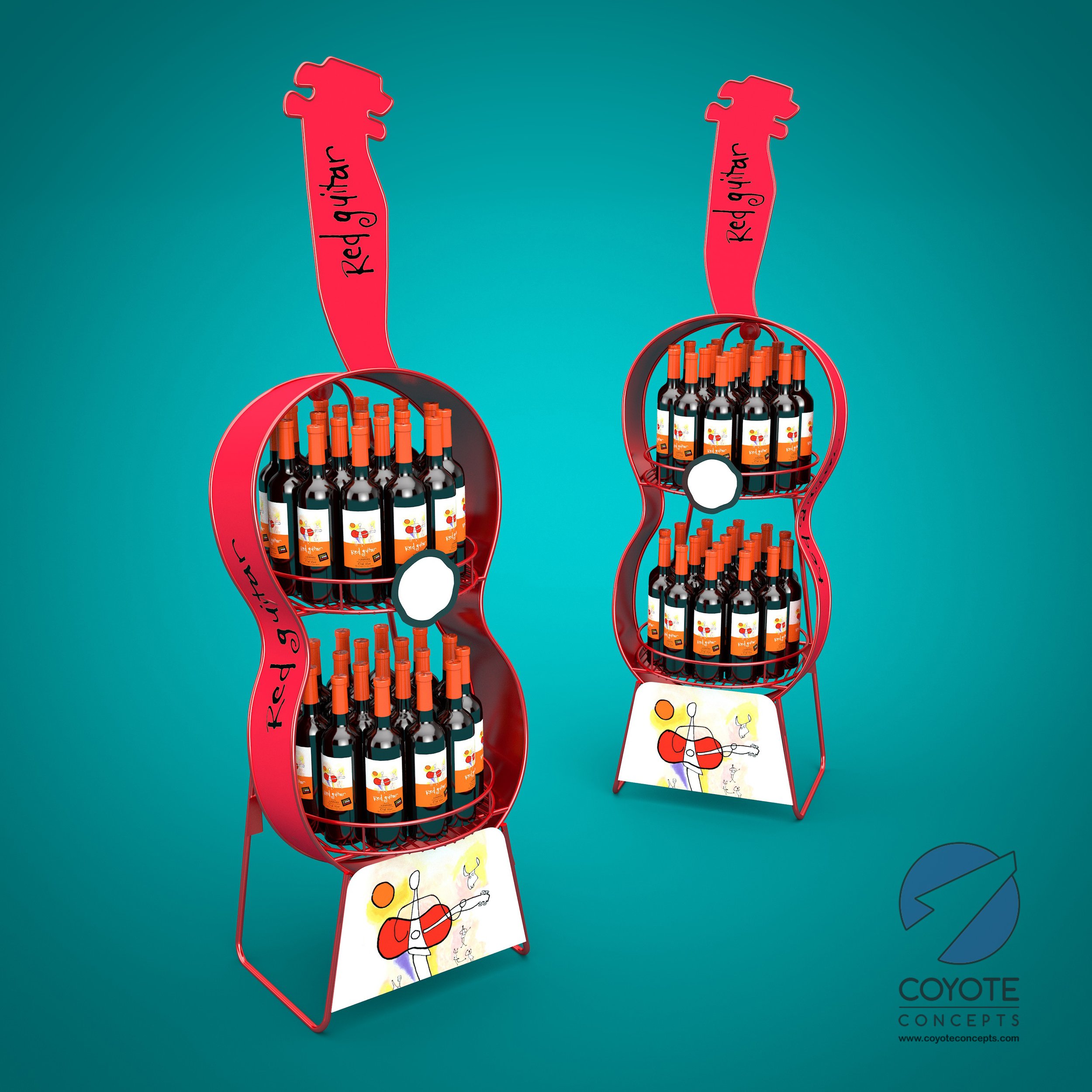
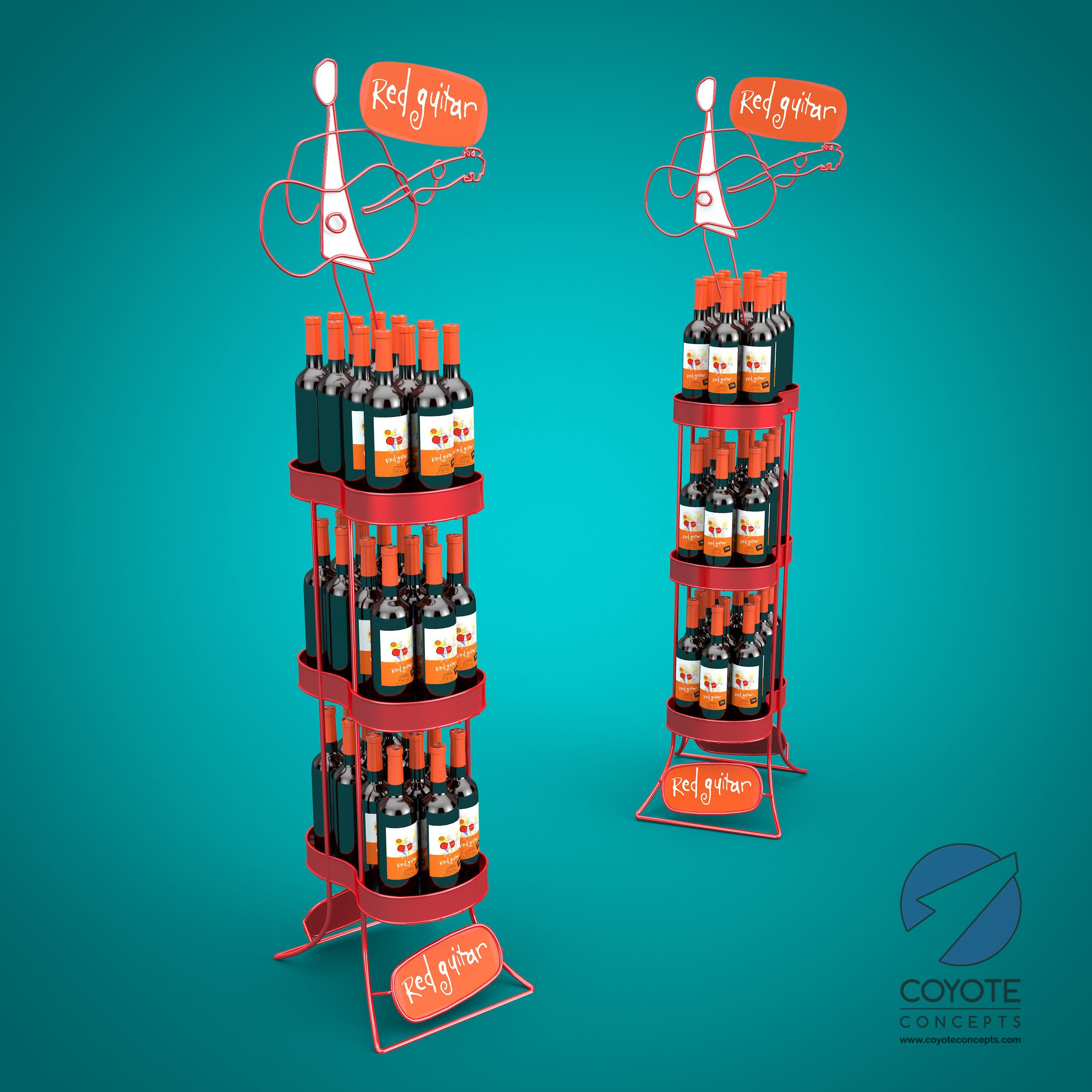
2 Creative Directions for a Whimsical Wine Display
When providing creative options, it’s best to make each one as different as possible from the next. This isn’t always easy when you have to stick to tight parameters in a brief. On the other hand, working with no parameters at all can be overwhelming. For a designer, something in the middle is where the magic happens. Of the two concepts below, the client ultimately chose the first one for its playfulness and visual impact. The second concept was much more space efficient, but in this case visual impact was judged more important than efficiency. What do you think?


